スタイルシートマニア
HTML5とCSS3でメールフォームのValidationと入力ヒント | ホームページカスタマイズ Tips
とにもかくにもデモをご覧ください。
http://source-marine.net/css-mania/sample/css3-and-html5-validation/
すごい便利ですね。
<!DOCTYPE html>
<html>
<head>
<meta charset="utf-8">
<title>HTML5 Contact Form</title>
<link rel="stylesheet" media="screen" href="styles.css" >
</head>
<body>
</body>
</html>
まあ、普通のhtml5ですね。
<form class="contact_form" action="" method="post" name="contact_form">
</form>
formも普通のフォームです。
<ul>
<li>
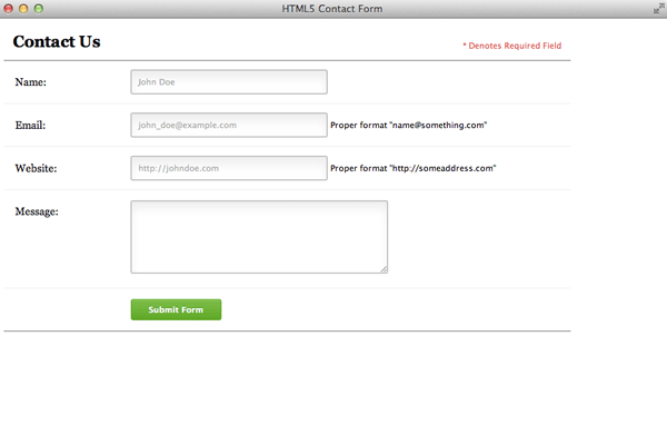
<h2>Contact Us</h2>
<span class="required_notification">* Denotes Required Field</span>
</li>
<li>
<label for="name">Name:</label>
<input type="text" name="name" />
</li>
</ul>
最近ふと思うんですが、inputやらtextareaやらやたらリストで囲む傾向があるような気がするんですけど、これはどういう意味があるんでしょう?
SEO?って考えるとメールフォームのキーワードで検索でひっかけようとするほど意味のないことはないと思うのでこの辺りはあまり合点がいかないような気がします。
まあ、それ以外は普通のフォームですね。っということはCSSに秘密があるのか!
<li>
    <label for="email">Email:</label>
    <input type="text" name="email" />
    <span class="form_hint">Proper format "name@something.com"</span>
</li>
やっとここでそれっぽいのが出てきました!
<span class=”form_hint”>で囲んだところがヒントとして表示されるんですね。
おそらく、CSSでhiddenにしといてactiveで表示みたいな感じでしょうか?
<li>
    <label for="website">Website:</label>
    <input type="text" name="website" />
    <span class="form_hint">Proper format "http://someaddress.com"</span>
</li>
<li>
    <label for="message">Message:</label>
    <textarea name="message" cols="40" rows="6" >
</li>
<li>
    <button class="submit" type="submit">Submit Form</button>
</li>
そのほかのアイテムも同じようにヒントを入れて追加して
<input type="text" name="name" placeholder="John Doe" />
<input type="text" name="email" placeholder="john_doe@example.com" />
<input type="text" name="website" placeholder="http://johndoe.com/" required/>
placeholderを追加します。placeholderはテキストフィールドなどに入力欄に初期表示する内容を指定するやつですね。
html5からの機能です。
ここでちょっと小技
:-moz-placeholder {
    color: blue;
}
::-webkit-input-placeholder {
    color: blue;
}
ってすると、大抵のブラウザでplaceholderにスタイルを設定できるとな!
時間の都合で実証をしてないです。
もうひとつ
*:focus {outline: none;}
ってすると、フォーカスした時に、アウトラインが付くのを消せるとな!
.contact_form ul {
    width:750px;
    list-style-type:none;
    list-style-position:outside;
    margin:0px;
    padding:0px;
}
.contact_form li{
    padding:12px;
    border-bottom:1px solid #eee;
    position:relative;
}
リストのスタイルを設定。
こういう理由でリストにするとでしょうか?
.contact_form li:first-child, .contact_form li:last-child {
    border-bottom:1px solid #777;
}
リストの最初と最後に下線を引く設定。
.contact_form label {
    width:150px;
    margin-top: 3px;
    display:inline-block;
    float:left;
    padding:3px;
}
.contact_form input {
    height:20px;
    width:220px;
    padding:5px 8px;
}
.contact_form textarea {padding:8px; width:300px;}
.contact_form button {margin-left:156px;}
フォームエレメントのスタイル設定
なかなか、秘密にたどり着けない感じがもどかしい。
.contact_form input, .contact_form textarea {
    border:1px solid #aaa;
    box-shadow: 0px 0px 3px #ccc, 0 10px 15px #eee inset;
    border-radius:2px;
}
.contact_form input:focus, .contact_form textarea:focus {
    background: #fff;
    border:1px solid #555;
    box-shadow: 0 0 3px #aaa;
}
/* Button Style */
button.submit {
    background-color: #68b12f;
    background: -webkit-gradient(linear, left top, left bottom, from(#68b12f), to(#50911e));
    background: -webkit-linear-gradient(top, #68b12f, #50911e);
    background: -moz-linear-gradient(top, #68b12f, #50911e);
    background: -ms-linear-gradient(top, #68b12f, #50911e);
    background: -o-linear-gradient(top, #68b12f, #50911e);
    background: linear-gradient(top, #68b12f, #50911e);
    border: 1px solid #509111;
    border-bottom: 1px solid #5b992b;
    border-radius: 3px;
    -webkit-border-radius: 3px;
    -moz-border-radius: 3px;
    -ms-border-radius: 3px;
    -o-border-radius: 3px;
    box-shadow: inset 0 1px 0 0 #9fd574;
    -webkit-box-shadow: 0 1px 0 0 #9fd574 inset ;
    -moz-box-shadow: 0 1px 0 0 #9fd574 inset;
    -ms-box-shadow: 0 1px 0 0 #9fd574 inset;
    -o-box-shadow: 0 1px 0 0 #9fd574 inset;
    color: white;
    font-weight: bold;
    padding: 6px 20px;
    text-align: center;
    text-shadow: 0 -1px 0 #396715;
}
button.submit:hover {
    opacity:.85;
    cursor: pointer;
}
button.submit:active {
    border: 1px solid #20911e;
    box-shadow: 0 0 10px 5px #356b0b inset;
    -webkit-box-shadow:0 0 10px 5px #356b0b inset ;
    -moz-box-shadow: 0 0 10px 5px #356b0b inset;
    -ms-box-shadow: 0 0 10px 5px #356b0b inset;
    -o-box-shadow: 0 0 10px 5px #356b0b inset;
}
っと色々たくさん書いておりますが、要するにsubmitにグラデーションの設定をしています。(ばっさり切ってしまった)
なんかこう簡単にできないもんでしょうか!
-webkitやら-mozやら-msやら・・・。各ブラウザが勝手な設定作りだすからこんなことになるんだよ!
ついでに、inputとtextareaに影つけて、フォーカスした時に、影の色を変えて背景色を白にして。
はい!だいぶ見た目が整ってきましたが、この後どうなるのか!
.contact_form input:focus, .contact_form textarea:focus { /* add this to the already existing style */
    padding-right:70px;
}
inputとtextareaにフォーカスされたときに右側にpaddingをつけます。
.contact_form input, .contact_form textarea { /* add this to the already existing style */
    -moz-transition: padding .25s;
    -webkit-transition: padding .25s;
    -o-transition: padding .25s;
    transition: padding .25s;
}
これは、CSSでトランジションをつけてますね。
こうすると「スパーンッ!」とpaddingが付かづになめらかーに「にょき」っとpaddingがつけられるんですねぇ。
素晴らしい!ちょっと勉強になりました。
input:required, textarea:required {
    background: #fff url(images/red_asterisk.png) no-repeat 98% center;
}
この:requiredっというのがよくわかりませんが、どうやら必須入力を意味するアスタリクスをbackgroundを表示しているようですね。
こうすると、inputやらtextareaの背景が設定できるということか・・・・。
っと思って:requiredを消してみたが何も変化なし・・・。
そんなこんなで色々いじっていたらどうやらここがミソのようです!
先ほどしれーっと
<input type="text" name="website" placeholder="http://johndoe.com/" required/>
っと書きましたが、
<input ほにゃららほにゃらら required/>
ってするとrequiredで入力チェックをするんですね。
んでついでにここに背景のスタイル入れちぇってことのようです。
こうすれば、必須入力が分かりやすくてしかも作る側にも優しいのでいいですね。
そして、こうすると必須入力を飛ばしてsubmit(送信ボタン)押そうとすると「このフィールドを入力してください」っと注意がでると言うわけです。
なるほど!
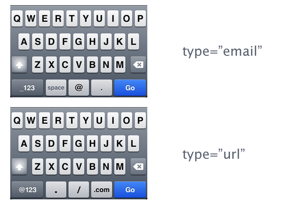
type=”text”っというのは普段僕らも使い慣れたinputに設定するタグですが、html5だとこれにtype=”email”とtype=”url”っというのができるのです。
こうするとiPhoneやらなんやらで入力の配列がメールようになったり、URLようになったりします。
確かに、あれこれ押して記号をだすのは面倒です。
特に、スマホはめんどくさいです。
っということで
<input type="email" name="email" placeholder="john_doe@example.com" required />
<input type="url" name="website" placeholder="http://johndoe.com" required/>
っとします。
.contact_form input:focus:invalid, .contact_form textarea:focus:invalid { /* when a field is considered invalid by the browser */
    background: #fff url(images/invalid.png) no-repeat 98% center;
    box-shadow: 0 0 5px #d45252;
    border-color: #b03535
}
focus:invalidでフォーカスされたらスタイルを変更。
これは何かと使えそうな予感がします。
.contact_form input:required:valid, .contact_form textarea:required:valid { /* when a field is considered valid by the browser */
    background: #fff url(images/valid.png) no-repeat 98% center;
    box-shadow: 0 0 5px #5cd053;
    border-color: #28921f;
}
:required:validで入力されたらスタイルを変更。この場合は緑に変わりますね。
ちなみにtype=”email”やtype=”url”とすることで、2バイト文字(要するに日本語)は正しい文字列として扱わなくなるので入力のやり直しを命ぜられます。しかも、CSSなのかhtmlなのかわかりませんが、入力値をリアルタイムでチェックしていますね。
お利口!
<input type="url" name="website" placeholder="http://johndoe.com" required pattern="(http|https)://.+" />
っとすることで、validのパターンが設定できます。(http|https)://.+の部分は正規表現のようですね。
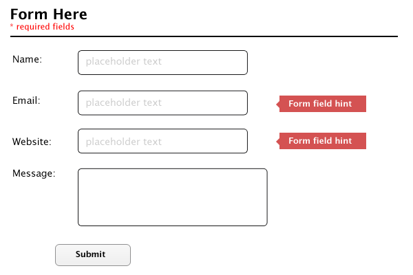
.form_hint {
    background: #d45252;
    border-radius: 3px 3px 3px 3px;
    color: white;
    margin-left:8px;
    padding: 1px 6px;
    z-index: 999; /* hints stay above all other elements */
    position: absolute; /* allows proper formatting if hint is two lines */
    display: none;
}
ヒントのスタイル設定です。
やはりdisplay: none;っとなっていますね。
.form_hint::before {
    content: "\25C0"; /* left point triangle in escaped unicode */
    color:#d45252;
    position: absolute;
    top:1px;
    left:-6px;
}
ヒントスタイルの前に\25C0で記号を使って吹き出しを表現しています。
よく考えられていますね。
.contact_form input:focus + .form_hint {display: inline;}
.contact_form input:required:valid + .form_hint {background: #28921f;} /* change form hint color when valid */
.contact_form input:required:valid + .form_hint::before {color:#28921f;} /* change form hint arrow color when valid */
ここでvalidが通ったら色が変わる設定をしていますね。
ついでにフォーカスされるとヒントスタイルをdisplay: inline;にして表示するようにしています。
これでめでたく完成でございます。
IEはどうしてこうも足を引っ張るのか!こんな厄介なブラウザを使うのはやめてGoogle Chromeを入れましょう!
とはいえ、emailにしても要は@マークがついているかどうかしかチェックしていないので、細かい所までチェックしようとしたらやはりjavascriptっということになりますね。
この辺りはまだまだと言ったところでしょうか。
だけど、スマホサイトのメールフォームなんかはこの辺りとjavscritpで連携させて上手く使えば今まで以上に簡単にメールフォームが作れそうな気がしますね。
| « 前の記事 | 次の記事 » |
庄野英朗
Source Marine 代表
デザイン・コーディング・PHPアプリケーションまでこなす。
マルチデザインプログラマ。
1 件のコメント